NodeOp
Every documentary eventually needs to show some data. Usually it’s simple: a year and location flashed on screen. But when the story involves climate trends, budget breakdowns, or population shifts, it demands an actual chart — and for most filmmakers, that’s where the options narrow fast.
Most of us know charts as PNGs grabbed from somewhere else, and even when we find them, they never match the film’s look. The alternative is hiring a motion graphics artist or becoming one for a few weeks. Animated charts in After Effects can look incredible, but they take days per sequence, and when your data changes two weeks before delivery, you start from scratch.
The systems already exist. Almost nobody uses them.
The tools we already use have powerful procedural systems built in. Blender has Geometry Nodes — a visual programming system that can generate and animate complex structures from raw data. But these features remain underutilized and poorly documented, with learning curves steep enough that most filmmakers never discover what they’re capable of.
Last year I worked as a 3D animator for Vibrant Building Technologies, creating airflow visuals and interface graphs. I kept hitting the same wall: I needed animated data visualizations, and the tools to make them efficiently didn’t seem to exist.
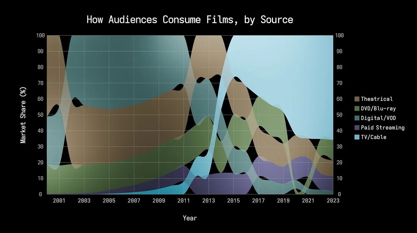
So I started digging into Geometry Nodes, and what I found surprised me. The system could take a spreadsheet, interpret the data, and generate a fully animated chart that updated whenever the source file changed — no keyframes, no manual rebuilding. The animation, layout, and scaling all derived from the data itself.
I’ve spent the past year turning that discovery into a Blender extension called NodeOp.
If you’re interested, bookmark nodeop.io ↗. The website will be live when the extension launches.